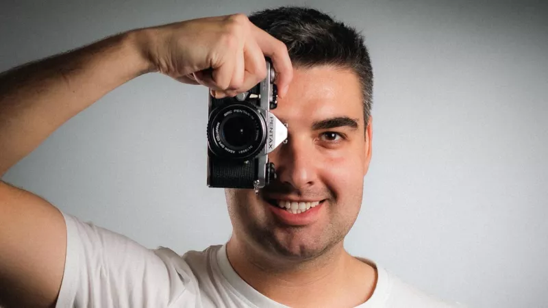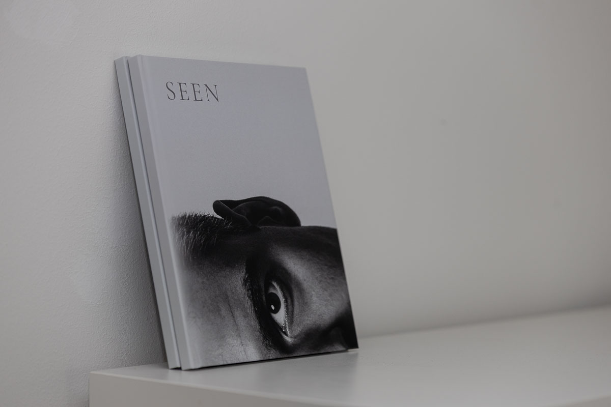
When the book arrived, the excitement lasted about five seconds. Then I noticed that the front and back covers were swapped. Not the printer’s mistake, mine. Somewhere between InDesign and upload I had set up the pages wrong and never noticed.
Then I remembered the next mistake: a few minutes after placing the order, I had realized that I’d accidentally picked glossy paper instead of matte. By the time I tried to cancel, it was too late.
Looking back, that actually fits this project quite well. SEEN was never something that was clearly defined from the start.
From My First 100 to Beyond Gaze to SEEN
The original idea came about two years ago. Back then, the book was supposed to be called My First 100. Not because they would have been my first 100 photos or the first 100 people in front of my camera, but simply as a working title for a collection of 100 portraits.
The plan was a kind of flip book. A black-and-white series started from one side, a color series from the other. Both halves were meant to meet in the middle. On screen, it all sounded surprisingly convincing.
The longer I worked on the project, the less the title fit. It wasn’t 100 people. Some appeared several times, others only once. At the same time, the whole concept began to change.
My First 100 became Beyond Gaze. The title stayed with the project for a while until it, too, disappeared at some point. With every new version, the book got simpler. Pictures dropped out. The color disappeared entirely. The original concept moved further and further into the background.
In the end, only a short title was left. SEEN. Why? Because it’s short and somehow fits: seen, looked at, gaze. There’s no more concept behind it than that.
Why a Photo Book at All?
The idea was never to simply order a photo book. A family album from one of the big providers is done in an hour. Pick pictures, drag them into a template, finished. I was interested in something else.
I wanted to know how my photographs feel in a format I mostly know from professional photo books. Not as single images on a website, not as an Instagram post, and not on a monitor. But as something physical. Something I can pick up, flip through, put down and open again later.
I was also drawn to the idea of doing the whole process myself. Not just the photography and the editing, but the design too. The order of the pictures. The size on the page. The spacing. The transitions. Every single decision.
How Do Portraits Become a Book?
The real challenge was never choosing the pictures. Of course the number had to shrink at some point. From the originally planned 100 images, I ended up with 30 portraits on 38 pages. The harder question was how that was supposed to become a book.
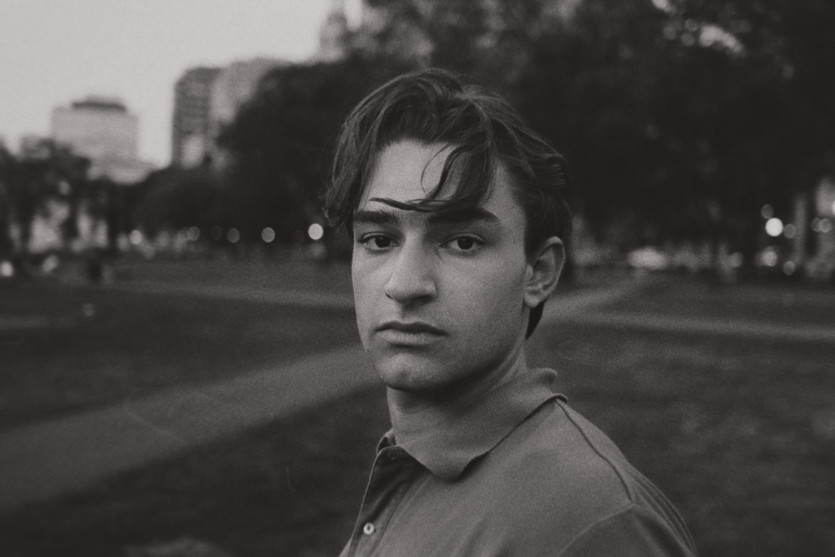
The photographs were taken between 2015 and today, with three different Canon cameras. One picture was shot on film with a Canon AE-1 and developed by myself afterward.
In between lie more than ten years, different people and completely different approaches. There are spontaneous shots, planned shoots, improvised setups with a Metz flash and a softbox made of cardboard and a trash bag, as well as newer studio shots with various flashes. Still, the whole thing shouldn’t feel like a hard drive folder full of single images.
I spent a surprising amount of time moving pictures around, changing the sequence and trying out combinations. When should a dark portrait be followed by a light one? When does a spread need calm? When do two direct gazes in a row work, and when not? There’s no right answer to many of these questions. I just notice when a picture has something.
The Placeholder
It was settled fairly early that the book would be made entirely in InDesign. Not because templates are inherently bad. But because I found the process as a whole exciting. If I was going to make a photo book, I wanted every step in my own hands.
That included the format. Originally I had something smaller in mind. At the same time, the pictures needed enough room. I’ve never particularly liked square photo books, and landscape was out of the question because of all the vertical images. In the end, a pragmatic solution won out, somewhere in between.
The cover also developed differently than planned. The crops on the front and back were originally just placeholders, to get a feel for the title and the design. I actually didn’t want to use my own portraits on the cover.
But the same thing happened with every alternative. I replaced the placeholders and found the new version worse. At some point I had to accept that a placeholder had long since become a decision.
The First Copy
When the book finally arrived, I was glad I had ordered only one copy at first. The swapped cover was annoying. The glossy paper, even more so.
And while matte would probably have been better already, it quickly became clear that an uncoated natural paper would probably have been the far better choice. There were other things that had never shown up on screen. Some pages showed through more than expected. Some image combinations looked different in print than in InDesign.
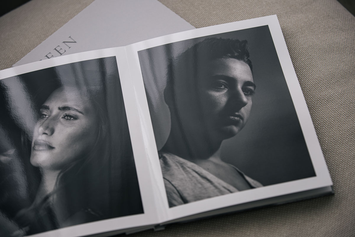
That’s exactly why the order was still not a failure. On the contrary. For the first time, I could judge what works and what doesn’t. Things that looked perfect on the monitor suddenly had to be questioned. Other decisions, on the other hand, felt right immediately.
The Second Copy
Layout adjusted, cover corrected, paper changed, book ordered again. When it arrived, I didn’t savor the anticipation first. I immediately checked whether the cover was right this time. It was. Then the paper.
The first copy was printed on photo paper, with a gloss that’s closer to plastic film. For single pictures that’s fine, but for a book it was simply wrong to the touch. Now it’s uncoated natural paper, and it finally feels like paper. Classier. My hunch was right. The show-through is completely gone. Some contrasts look slightly different from what I know from the screen.
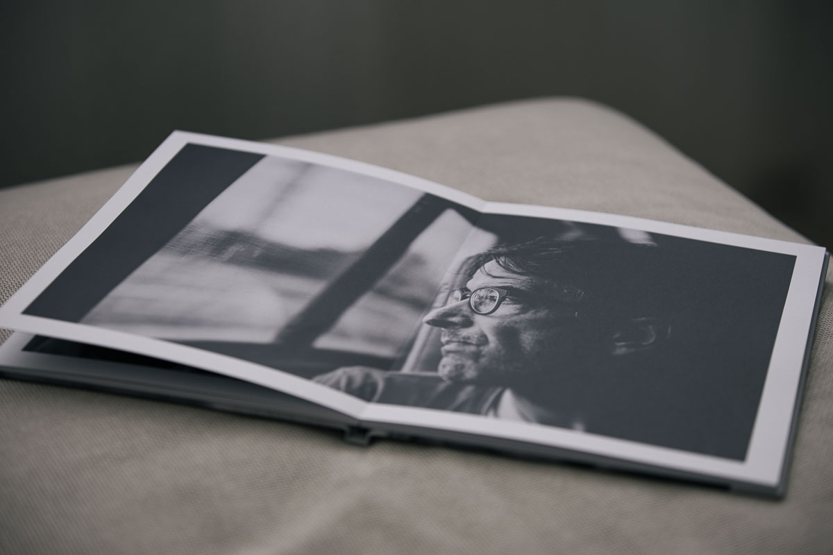
On this paper, the portraits look different once more. The feel, the flipping through, the gazes from page to page: it’s better than any display. And now I have something physical I can put in someone’s hands.
Whether it stays this way, I don’t know yet. Maybe I’ll order two or three copies to give away. Whether SEEN is finished after that or whether something new is coming, honestly, remains to be seen.
At least the cover is right.